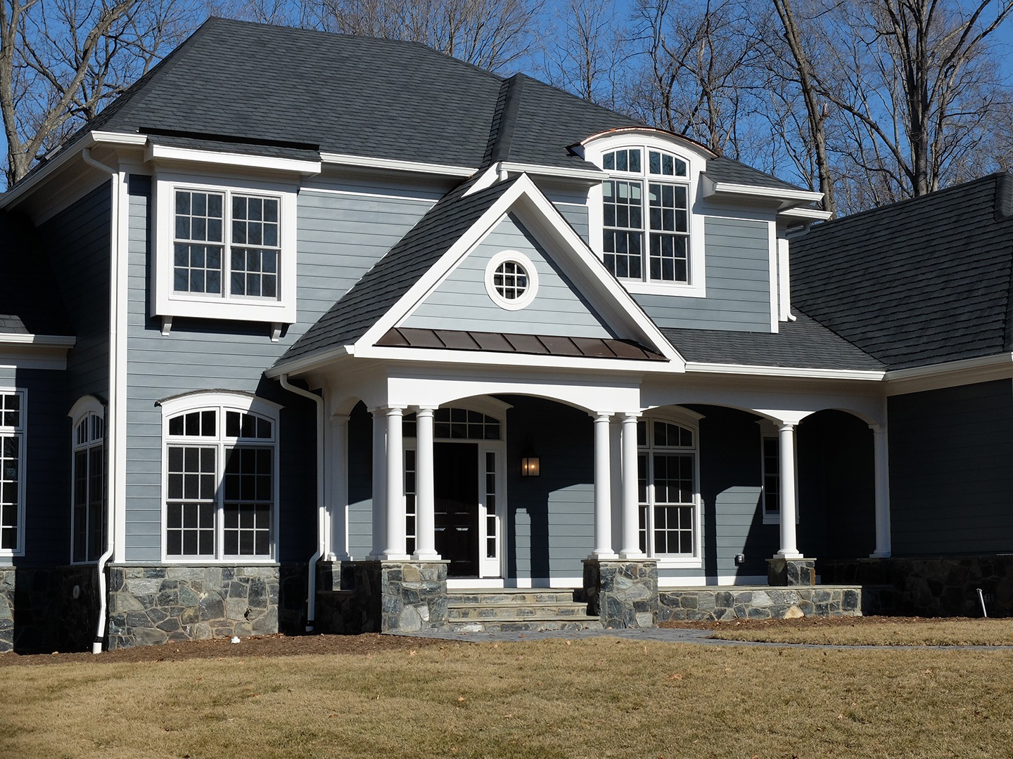
Finishes for Contemporary Homes With Timeless Appeal
In decades past, contemporary home designs avoided any unnecessary ornamentation. This made for clean, bold exteriors, often in wood or metal, that played up lines, angles, and volume— but which could also seem stark. A focus on clean, spare design might eliminate baseboards on interior walls, and feature windows and doors with no or minimal casings and trim. The intended effect was simplicity, crispness, and tranquility, but interior ambience sometimes edged into a cold, sterile or clinical vibe.
The more extreme elements of these designs also could impact a home’s livability—a lack of trim exposes joints and leaves edges and surfaces vulnerable to damage from routine activities like vacuuming and moving furniture. Similarly, dramatic floating stairs without risers can create safety risks.
Because both design elements and the overarching home design were so specific, contemporary homes were also emblematic of their eras. As a result, owners had few graceful ways to update their homes without painstakingly matching the original design or risking design integrity with new decorative elements that didn’t fit the original concept (imagine embracing 1970s finishes in a 1950s contemporary kitchen, for example).
In contrast, many of today’s contemporary homes embrace livability in tandem with style. Clean-lined exteriors, open concept floorplans and an abundance of natural light evoke simplicity, while incorporating clean finishes and streamlined trim details that lend a sense of warmth without visual clutter.
A fine sense of balance is essential; choosing simple trim and incorporating natural wood or stone for texture make a harmonious and inviting exterior when done well. When done poorly, multiple finishes can create a visually discordant mishmash. Examples are “craftsman” style homes from the late 2010’s that often suffer from an abundance of siding textures, paint colors, roofing materials and stone and come off as incoherent. Too many different trim and finish materials destroy the intended clean and contemporary effect.
Contemporary farmhouses often gain their current feel from details such as the shape and location of windows, square pickets on stairways and porch railings, and contrasting white (or light) siding with a dark roof and black windows. The roofs are often simple, with strong gables (“triangles”) In front and simpler roofs over the bulk of the house. We are also seeing contemporary takes on other styles, like Contemporary Tudor, and Florida and California contemporaries are also starting to pop up in Great Falls and McLean.

The stark contrast of white and black is very on trend – but will eventually date a home. You can always change the roof color or repaint later, and the classic farmhouse lines will work with a refresh. What’s important is ensuring you have similar flexibility for the windows. Fortunately, there are a wide variety of finish and color options for windows. If you choose a black finish on the inside as well as the exterior of the windows, that sets tone for interior, such as electing black trim throughout. But you could also choose windows with a black exterior and white interior surface (which is neutral and less stylistically limiting) or opt for window trim that is paintable to afford design flexibility when black windows are no longer popular.
Contemporary farmhouses afford more downstream flexibility because they marry a classic home form with trendy design elements that are easily changed.
About Gulick Group, Inc.: Established in 1987, Reston-based Gulick Group has developed communities throughout Fairfax and Loudoun Counties, including One Cameron Place and Newport Shores in Reston, The Reserve in McLean, Autumn Wood, Grovemont, and the three Riverbend Communities in Great Falls, Red Cedar West in Leesburg, and Wild Meadow in Ashburn.
